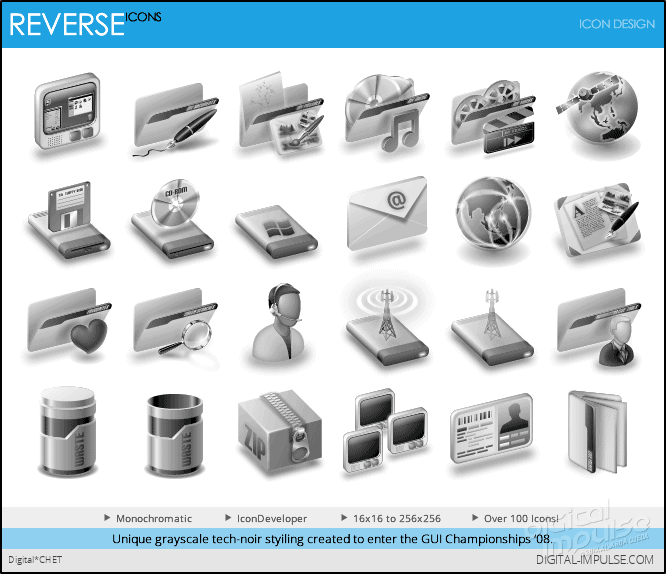
After almost a year in development, involving much tinkering and several re-edits focused on achieving the right look and feel, I present to you my GUI Championships entrant, Reverse IconPackage.
With it’s decidedly future-retro look and grayscale palette, Reverse IP aims to take you back to the era of black & white visuals, and the wonders of emerging technologies of yesteryear but with a decidedly modern flair.
Desktop “tech-noir” styling is now that much closer to achieve with this IconPackage.
While it did not win any awards, it was well-received and praised for its unique styling and approach.
Here’s what the judges had to say and how they rated the package:
Frogboy(Brad Wardell, CEO of Stardock) | KarmaGirl | Zoomba | |
Usability | 7/10 | 7/10 | 7/10 |
Originality | 7/10 | 6/10 | 7/10 |
Overall | 7/10 | 5/10 | 6/10 |
Comments | A grayscale concept that personally I think might have been better off as a colorful icon package. The problem with grayscale is that it tends to decrease contrast which can reduce usability. The art quality is top notch. Full [WindowsXP] and Vista support, users looking for a more minimalistic theme that’s easy on the eyes will definitely like this. | This is a very complete icon set that will serve [WindowsXP] and Vista users very well. The only problem with this set is the grayscale can make it hard to differentiate between icons in some cases. I want to like this set, but gray just doesn’t do it for me and makes it pretty hard for me to read my desktop. If this had a splash of color (not much, just a little) this would be a top-contender in my book. Grayscale was a big risk and the icons have a very unique look as a result. |
So take a look for yourself, download, and comment and/or critique if you feel so inclined. 8)


Recent Comments