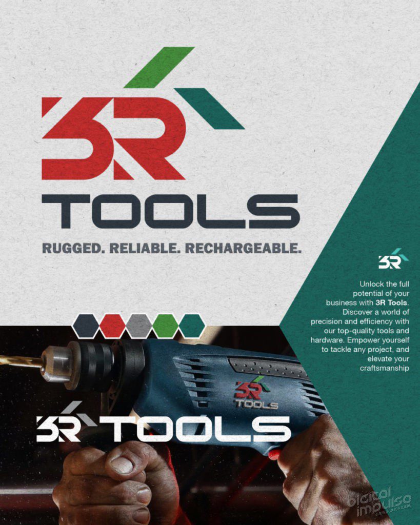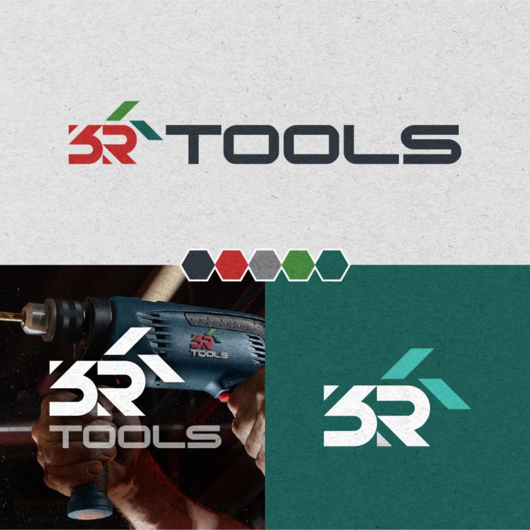
The 3R Tools concept logo is a strong and simple design that conveys the company’s values of strength, reliability, toughness, and innovation. The employs the use of abstract geometric shapes to render the 3R, and takes cues from the negative spacing to create accents. The shapes are rendered in a bold, masculine style, with sharp edges to suggest a sense of depth.
The typography is likewise a strong, simple, sans-serif font, with a heavy weight that matches the strength of the shapes, but aims to suggest precision, flexibility, adaptability, and resilience. The overall effect is a logo that is both visually appealing and memorable, and that effectively conveys the company’s values.
What do you think of this? Does it work?
Have you seen a design like this before, let me know?
Are you in need of design services for your business? Hit me up.

Recent Comments