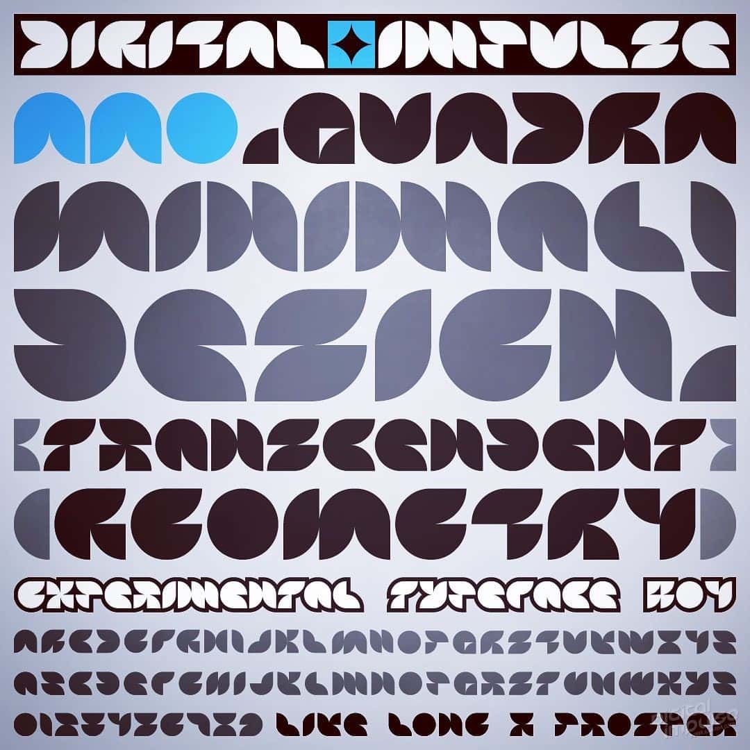
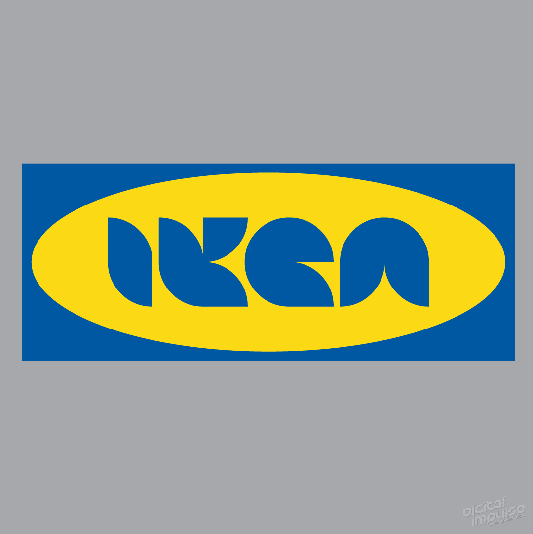
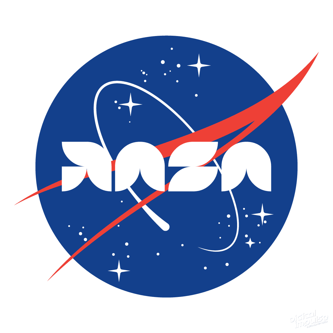
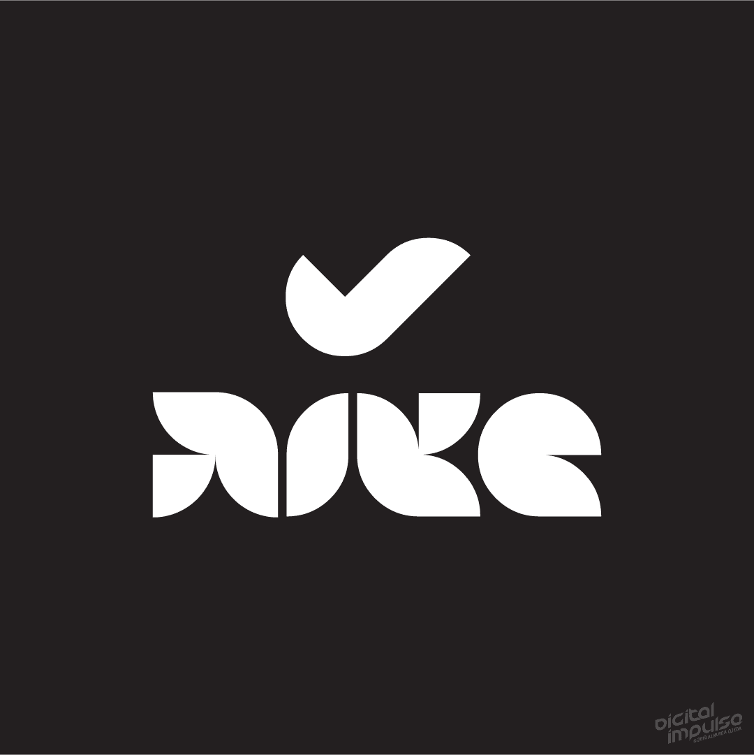
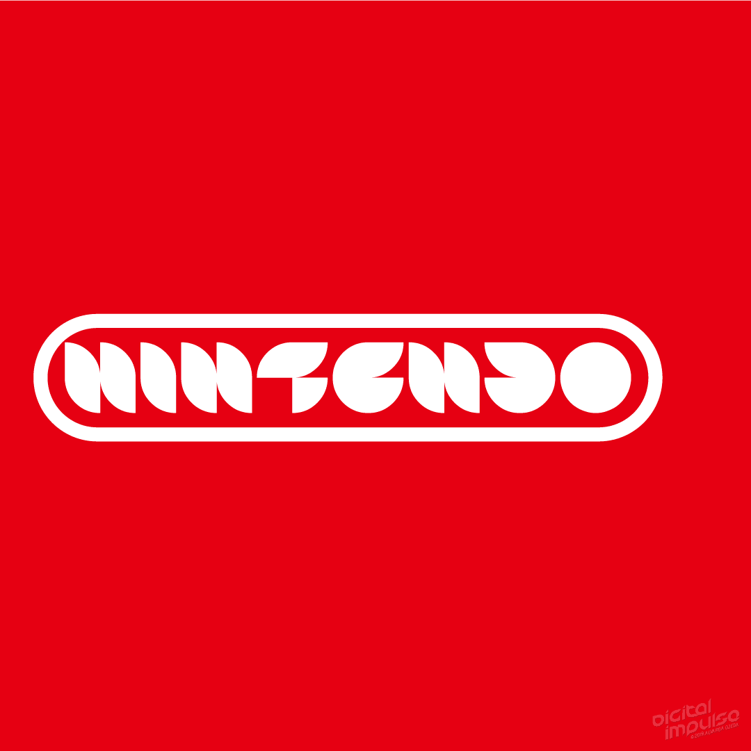
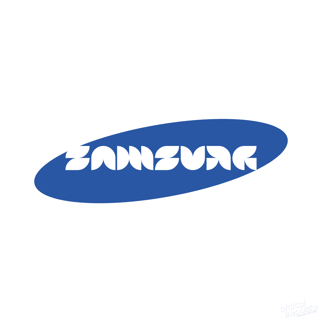
Messing around with type design once again. Came up with a typeface I call AAO-Quadra.
I tried to stay as basic as possible with this one so I picked a quarter-circle to work with. A nice, flexible, and minimal starting point, I think.
I love the challenge of problem solving different versions of characters to fit a particular style, and designing something as minimal as possible while remaining legible.
However, because this process also often spawns ideas for other styles, I often find myself getting sidetracked going down a completely different road than I started off on, just because I’m trying to get a version all done before the full vision leaves my head. 😂
Good times.
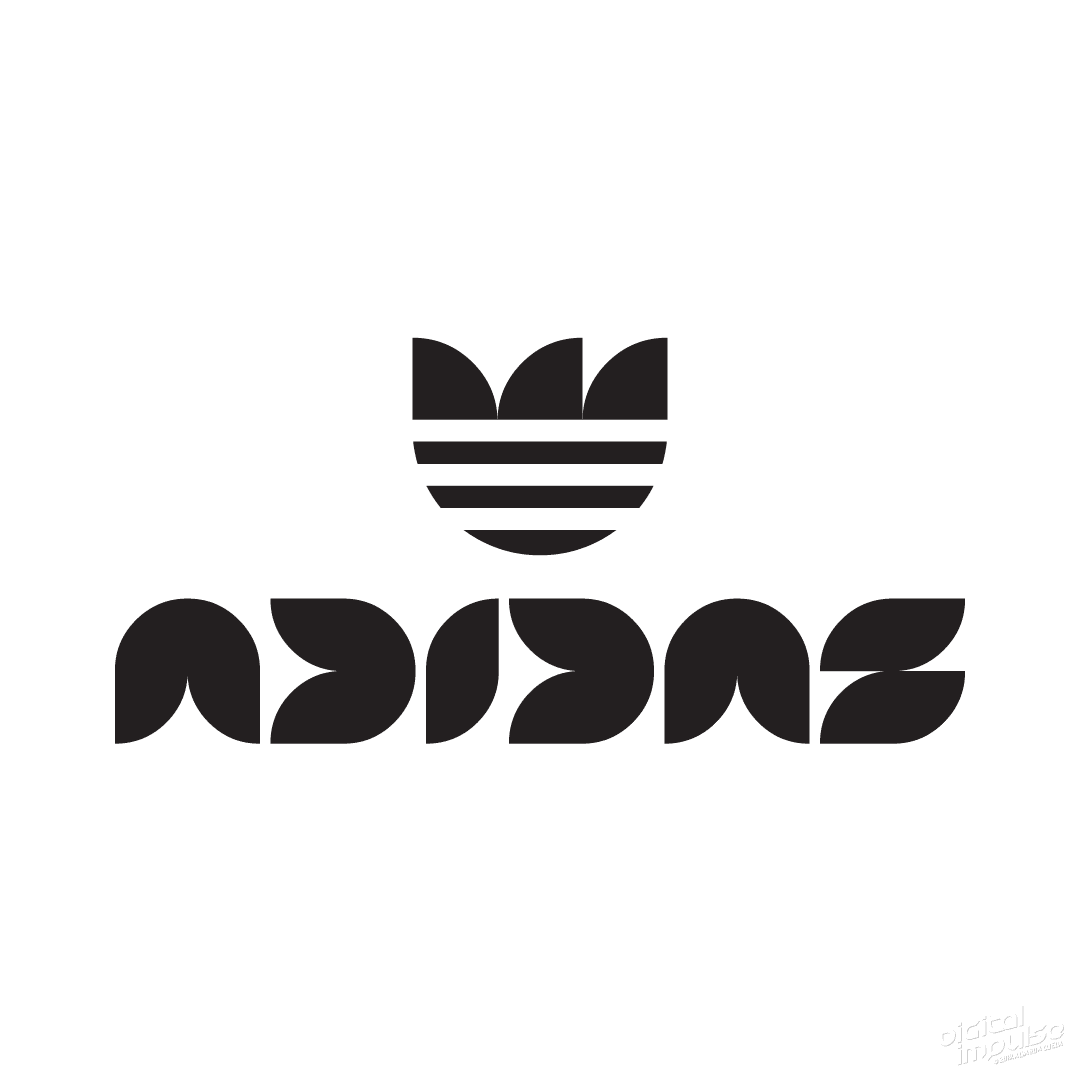
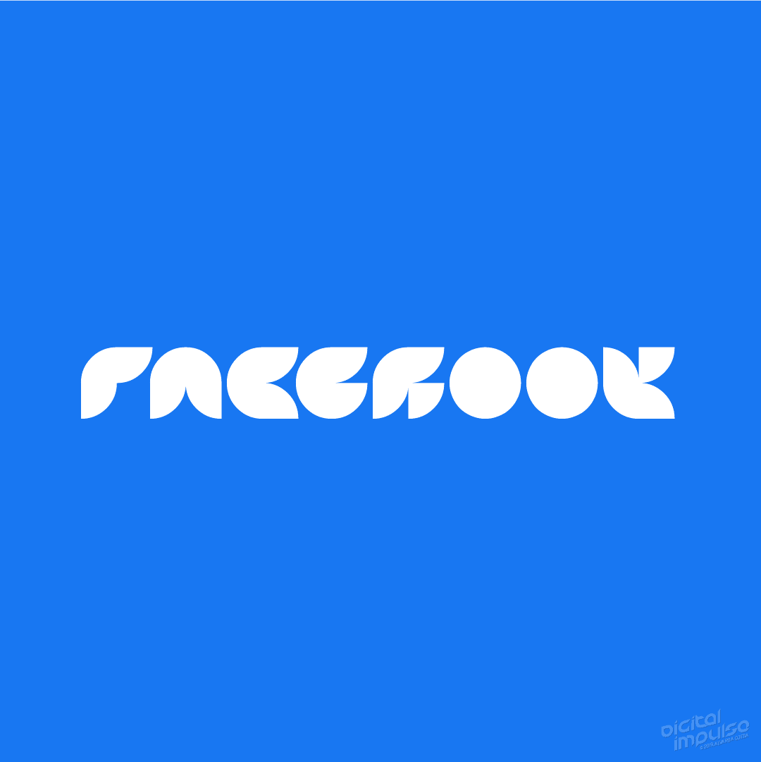
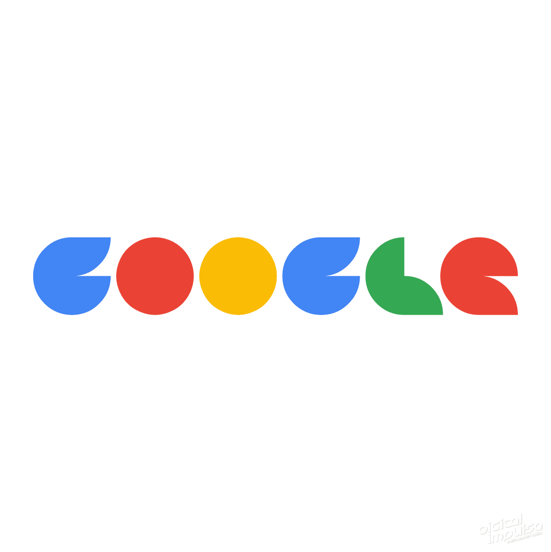
But anyways, take a look at some popular brand logos remixed with this typeface.


Anyways, if you like it, let me know what you think; like it, love it, share it, comment or just ignore it… i can’t tell you what to do, sheesh! ¯\_(ツ)_/¯

Recent Comments